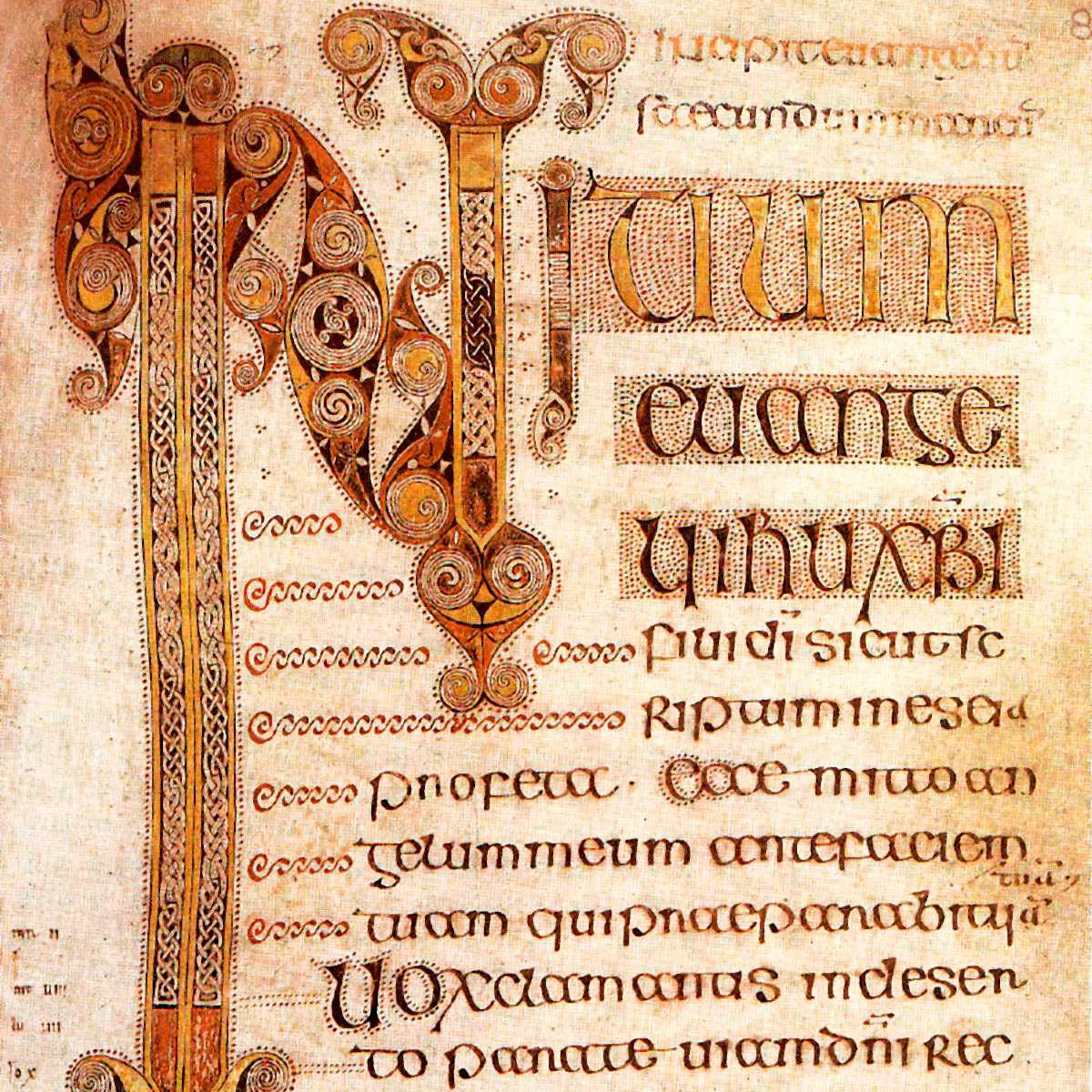
It all started in the beginning, well depends who you are talking to. I believe in dinosaurs and evolutions but for those who do not… It starts with the Bible and black letter and that is where i am starting with my history of scale use with type.
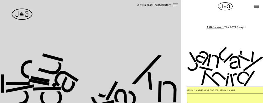
It determines the hierarchy of the page and helps the user understand what is important and where they are supposed to look first.
“It works best when contrasted elements are directly juxtaposed; proximity emphasizes the contrast.” - Christopher Moscato, University of Northern Colorado
What even is visual hierarchy? According to Gestalt physchology, visual hierarchy is a pattern in the visual field where in some elements tend to "stand out" or attract attention more than others, suggesting a higher importance.
The Gestalt psychology theory that proposes that the human brain has innate organizing tendencies especially when processing visual information.
But Why? There is evidence that when something is designed well, they exhibit more similar eye movements (measured by the Fréchet Distance).
The brain is able differentiate objects based on the characteristics that fall within four categories: color, size, alignment and character.
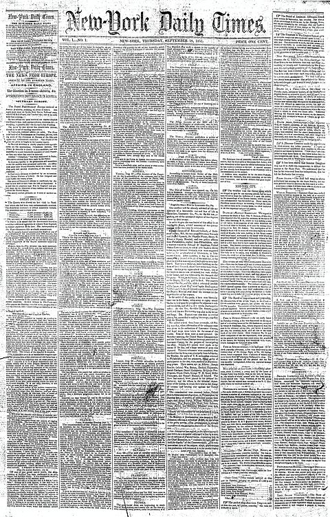
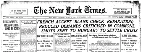
The New York Times has a nice transition from 1851 to 1919, when they started to understand the need for type scale to get the reader to understand the main stories/most polarizing
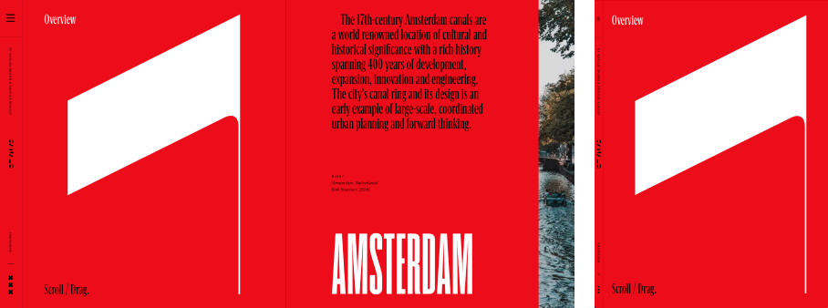
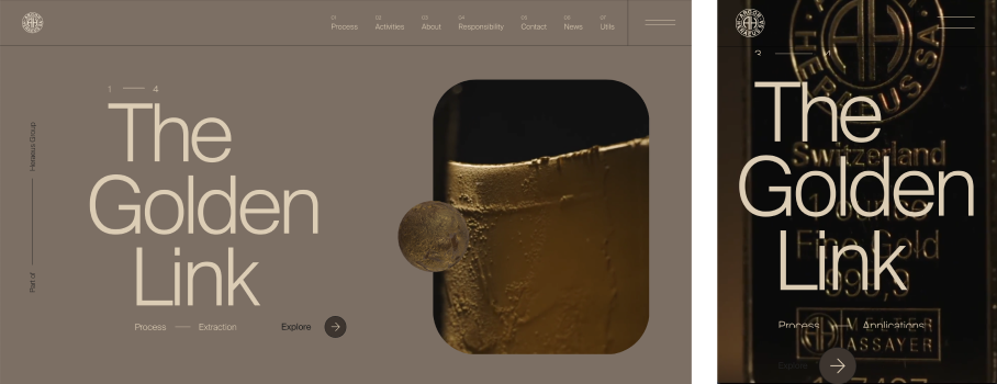
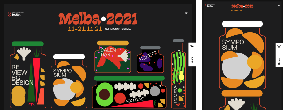
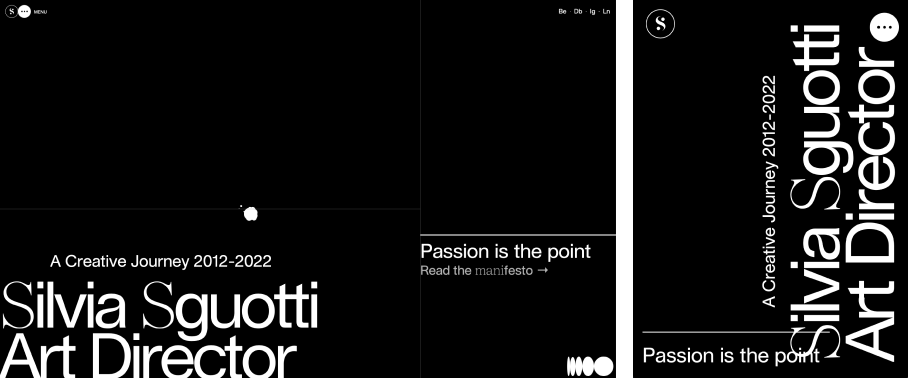
As you can see, the one with hierarchy simply comes off more readable. Although there is still a lot to consume, the variation tells me where to start.